Using Tables is a good choice to represent data in a striking manner in your Blog-post. But the problem is that, if you are using Blogger Blog then you may face difficulty while implementing tables on your post as Blogger Blog doesn’t provide any drag and drop plugins for that. However, you can do this manually through coding. But if you don’t have any coding knowledge then without wasting time just follow this tutorial – how to implement a good looking responsive data table in the Blogger post.
What Is Responsive Table:
Responsive table means its layouts are defined specifically for different display sizes or viewport so that it can scale itself accordingly. Therefore designing and implementing a responsive table needs two things:
- Generic HTML codes
- Custome CSS codes.
So it is clear that to implement a responsive table in your Blogger post you need HTML and CSS codes that you will get from here.
Now you have both HTML and CSS codes but the question is that where and how you can put those codes so that you will be able to use the responsive table in your Blog-post.
Here are the tasks that you have to do to implement the responsive table in your Blogger post
- Put CSS code in your Blogger theme (One time)
- Put HTML code in your Blog post (When requires)
1. Put CSS code in your Blogger theme:
There are two different way that you can put CSS code in your Blogger theme
Way 1:
To add responsive CSS code into the Blogger theme
- Sign in to Blogger
- Then click on Theme > Customize
- After that, head-on “Advanced” and then “Add CSS”. Now you will see a box titled “Add custom CSS” on the right side of the window.
- Now copy the below CSS code and paste it on to the box and then click on Apply to blog.
/*CSS for Responsive Table By gettechsupport.in*/
  .restable
   {border-collapse:collapse;
   width:100%;
   overflow: hidden;
   }
   .rescap{
     border-left:4px solid #009879;
     padding:15px;
 font-family:georgia;
 font-weight:bold;
 font-size:20px;
 background-color:#dddddd;
 color:#990a00;
 text-align:left;
 overflow:hidden;
 margin-bottom:4px;
 width:100%;
 }
.resth{
    padding:12px 15px;
    background-color:#009879;
    color:#ffffff;
    font-family:georgia;
    font-size:20px;
    font-weight:bold;
    border:1px solid #dddddd;
    text-align:center;
    }
.restr{
    border:1px solid #dddddd;}
 .restd{padding:12px 15px;
    font-family:arial;
    font-size:20px;
    text-align:center;
    border:1px solid #dddddd;
    }
.restr:last-of-type{
    border-bottom: 2px solid #009879;
    }
.restr:nth-of-type(even){
    background-color: #f3f3f3;
    }
Way 2:
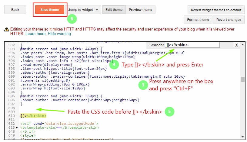
Also, you can add CSS code into blogger templates by the following way-
- Sign in to Blogger
- Then click on Theme > Edit HTML
- Now you will see HTML editor widget, click anywhere on the box, and press “Ctrl+F” key.
- Then type ]]></b:skin> in the search box at the right side of the HTML editor widget and press Enter to find this tag in your blogger template.
- Paste the above CSS code before ]]></b:skin> tag.
- Now click on Save theme.
Once you have done with adding CSS codes in the Blogger theme proceed to the next step in order to implement the responsive table in your Blog-post.
2. Put HTML code in your Blog post:
- Copy the above HTML codes and paste it On the Text Editor like notepad or notepad++
- Customize it according to your requirements and copy it again.
- Then go-to the Blogger post and then click on HTML and paste it.
 <div>
 <table class="restable">
<caption class="rescap">Simple Responsive Data Table</caption>
<tbody>
<tr>
<th class="resth">Name</th>
  <th class="resth">Marks</th>
  <th class="resth">Status</th>
  </tr>

<tr class="restr">
  <td data-label="Name" class="restd">Mou</td>
  <td data-label="Marks" class="restd">178</td>
  <td data-label="Status" class="restd">Pass</td>
  </tr>
<tr class="restr">
  <td data-label="Name" class="restd">Priya</td>
  <td data-label="Marks" class="restd">169</td>
  <td data-label="Status" class="restd">Pass</td>
  </tr>
<tr class="restr">
  <td data-label="Name" class="restd">Suman</td>
  <td data-label="Marks" class="restd">97</td>
  <td data-label="Status" class="restd">Fail</td>
  </tr>
<tr class="restr">
  <td data-label="Name" class="restd">Fatima</td>
  <td data-label="Marks" class="restd">120</td>
  <td data-label="Status" class="restd">Pass</td>
  </tr>
</tbody></table>
</div>
That’s it, you can customize the responsive table according to you. Finally, if you find this post helpful or if you face any problem, please don’t forget to comment below.


I got this website from my friend who shared with me about this website and at the moment this time I am visiting this web page and reading very informative posts at this place.
Wow! Simple and useful thank you sir